program director dashboard overview
Please Note: Dashboard views may vary depending on administrator permissions.
Some categories may not be available. Unless filtered by a specific time range, all information displayed is in real time.
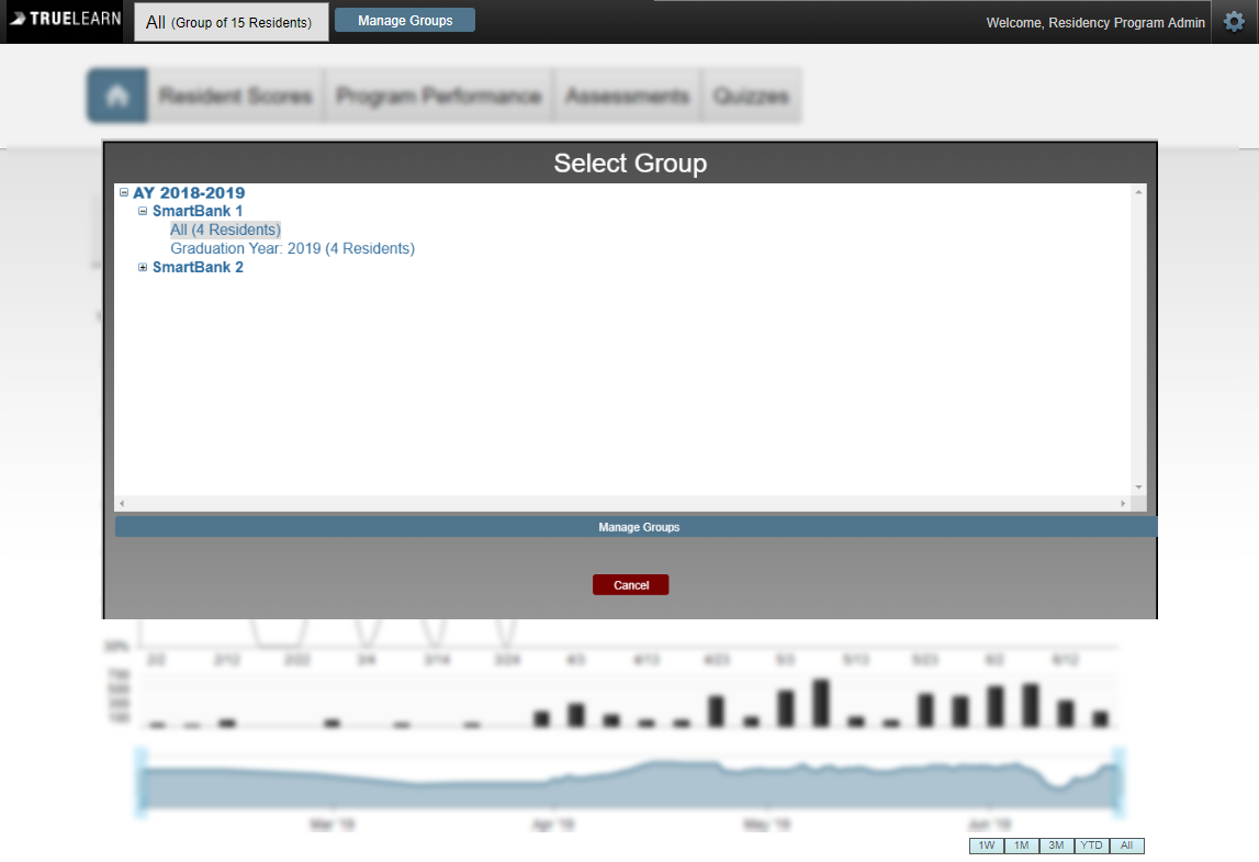
Getting Started: Select Group
Prior to looking at the charts/graphs, administrators can click on the grey box beside “Manage Groups” to select SmartBank subscriptions (Ex. “Graduation Year: 2019 (4 Residents)”). When a roster is uploaded, the “All” Group is automatically created in addition to the “Graduation Year” group. The corresponding dashboard displaying all performance tracking data will appear based on the group that has been selected.
Manage Groups
By clicking on “Manage Groups”, the administrator has the ability to create specific sub groups to provide more focused performance tracking as needed.
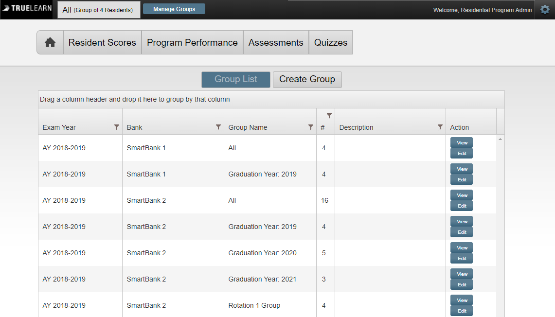
How to Create a Group:
Click “Create Group”
Name the group and give it a description
Select the SmartBank subscription from the exam dropdown menu
Select “Add Members” to choose residents to add to the group
Please note, adding residents to a sub group does not remove them from any other group
Set the faculty permissions (“View”, “Edit”, or “None” access)in the “Permissions” box located at the bottom of the page
Click the “Create Group” button at the bottom of the page to finalize
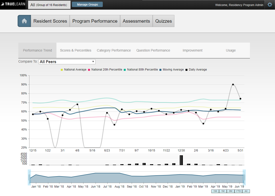
Performance Trend Graph
The different colored lines on the performance trend graph represent the “National Average”, “National 20th Percentile”, “National 80th Percentile”, “Moving Average”, and “Daily Average”. To view a specific date range within the graph, administrators can adjust the blue slide bar at the bottom.
Administrators can hover over the black dots within the graph to view,
- Date Range
- Total number of questions taken by residents within the date range
- Residents’ overall percentile within the date range
- The National Percentage of all residents utilizing the same questions within the date range
Administrators can click on the black dots within the graph to view the same information broken down by day within the selected date range. Directly above the graph, administrators can select the “Compare To” dropdown to compare group data to “All Peers” or specific graduation years.
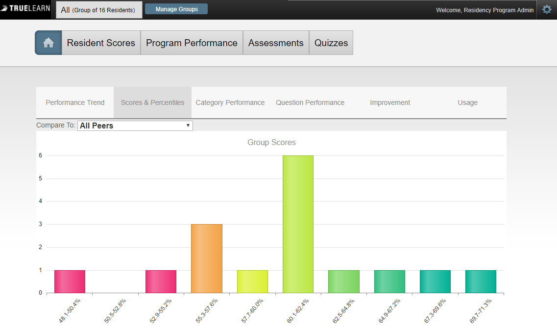
Scores & Percentiles
The “Scores and Percentiles” chart shows the distribution of residents categorized by overall score and percentile.
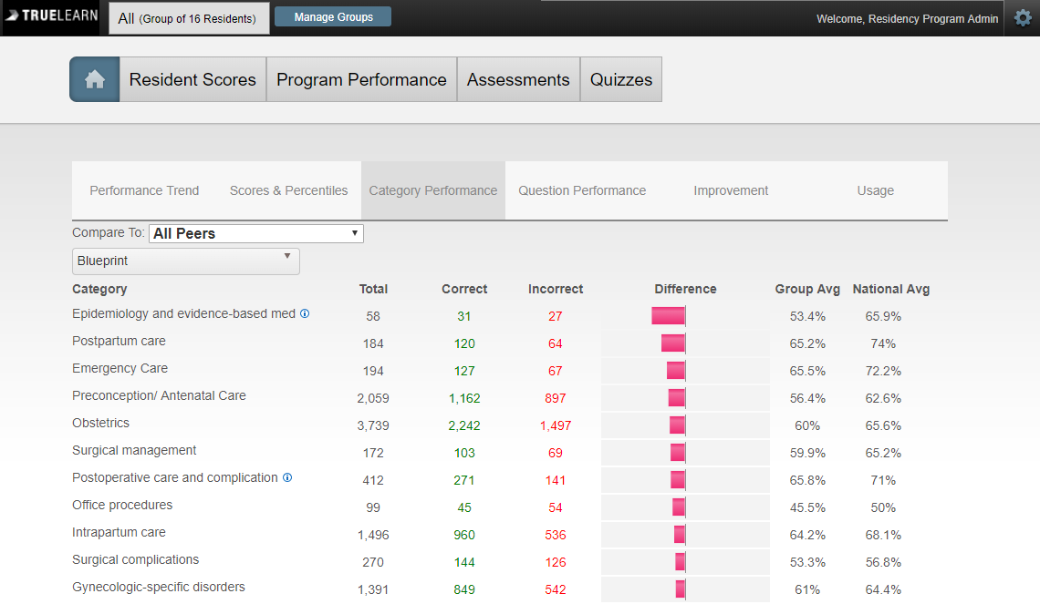
Category Performance Graph
The “Category Performance” graph shows the overall performance of residents compared to the National Average by category. This information includes, subjects that residents are strong in, as well as subjects in which they are falling behind. The graph shows the total number of questions taken by subject, how many were correct, and how many were incorrect. Directly above the graph, administrators can select the “Compare To” dropdown to choose whether they are comparing their residents’ data to “All Peers” or to a graduation year.
By clicking on the Axis dropdown menu below the “Compare To” section, administrators can choose to display information based on various tagged categories (ex. “Exam Blueprint” or “Body System”).
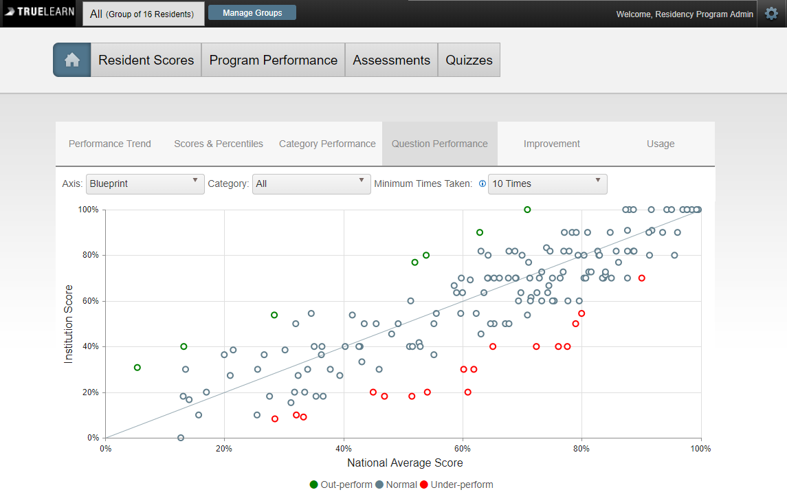
Question Performance Graph
The “Question Performance” graph allows administrators to view specific questions from the bank. There is a “Category” dropdown at the top of the graph that will allow administrators to select either specific question categories, or choose to view all questions, which is the default.
Administrators can select a category Axis by clicking on the dropdown menu to display corresponding data (Ex. “Body System”). Next, administrators can select the Axis from the “Category” Dropdown (Ex. Nervous System). Lastly, administrators can select a time from the “Minimum Times Taken” dropdown. This will allow administrators to view how the residents within the group they selected are performing on individual test items.
Each circle (data point) within this graph represents a question.
The blue line is considered “average”.
Blue circles are indicative of any questions the administrator’s group has taken for which their scores are considered “normal” compared to the nation.
Green circles indicate questions on which the administrator’s group has outperformed compared to the nation.
Red circles indicate questions on which the administrator’s group has underperformed compared to the nation.
By hovering over any of these circles, administrators will be able to view,
The question topic
Question statistics
How the question is tagged in various Axes
Clicking on any of these circles will bring up the full question for administrators to review. The full question can also be viewed by clicking the “Click to view question” hyperlink.
New questions vs. Repeat/Used/ already taken questions (Copy the section from below here .
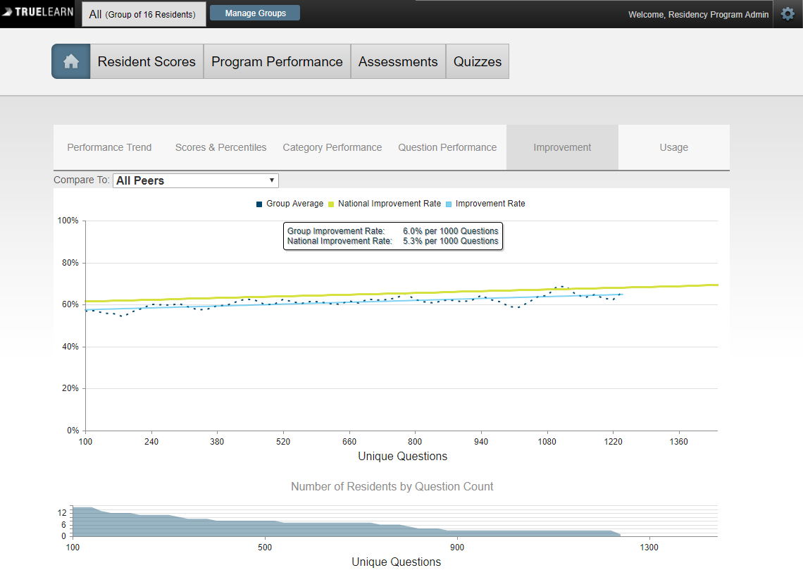
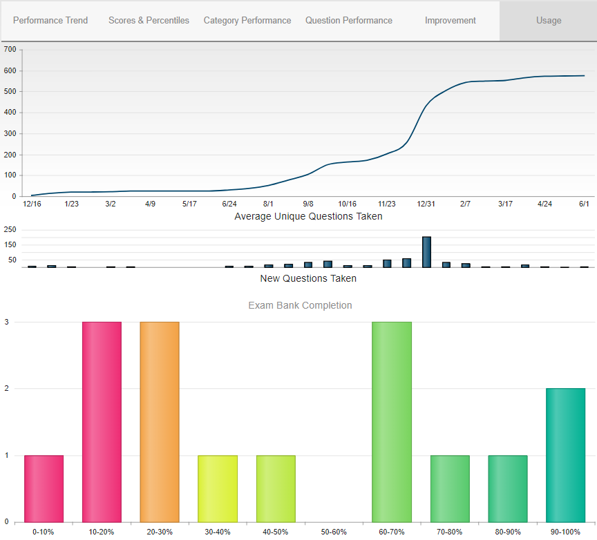
Improvement Chart
The “Improvement” chart displays the residents in the selected group’s moving average performance as a function of the number of unique questions taken. The residents in the selected group’s score will increase or decrease as more questions are taken, allowing the administrator to see the average rate of improvement and understand how it compares to the National Average performance and rate of improvement.
Usage Chart
The “Usage” chart shows the residents in the selected groups’ count of questions taken at different times during the program’s subscription. The bar graph below summarizes the “Exam Bank Completion” percentages and where the residents in the selected groups fall based on their performance.
Resident Scores
At the top of the Resident Scores page, you will see four symbols. They represent the following: Globe – Statistics for all tests; Hourglass – Statistics for Timed Tests; Globe with Red “x” through it – Statistics for Untimed Tests; Person Reading – Statistics for Tutor Mode Tests. By selecting any of these symbols, the Student / Resident Scores information will be updated accordingly. You will see a graph under this tab titled “Performance By Percent of Questions Used”. You can hover over the dots on this graph to see how many of your students / residents are taking questions. Next to each resident listed, you will be able to see a summary of the total number of questions they have taken, the total number they have gotten correct, and the total number they have gotten incorrect. Their last login date will also be displayed, as well as an optional “Anticipated Exam Date” field. This information can be set by the resident.
- Globe – Statistics for All Tests
- Hourglass – Statistics for Timed Tests
- Hourglass with Red “X” through it – Statistics for Untimed Tests
- Person Reading – Statistics for Tutor Mode Tests
By selecting any of these symbols, the “Resident Scores” information will be updated accordingly.
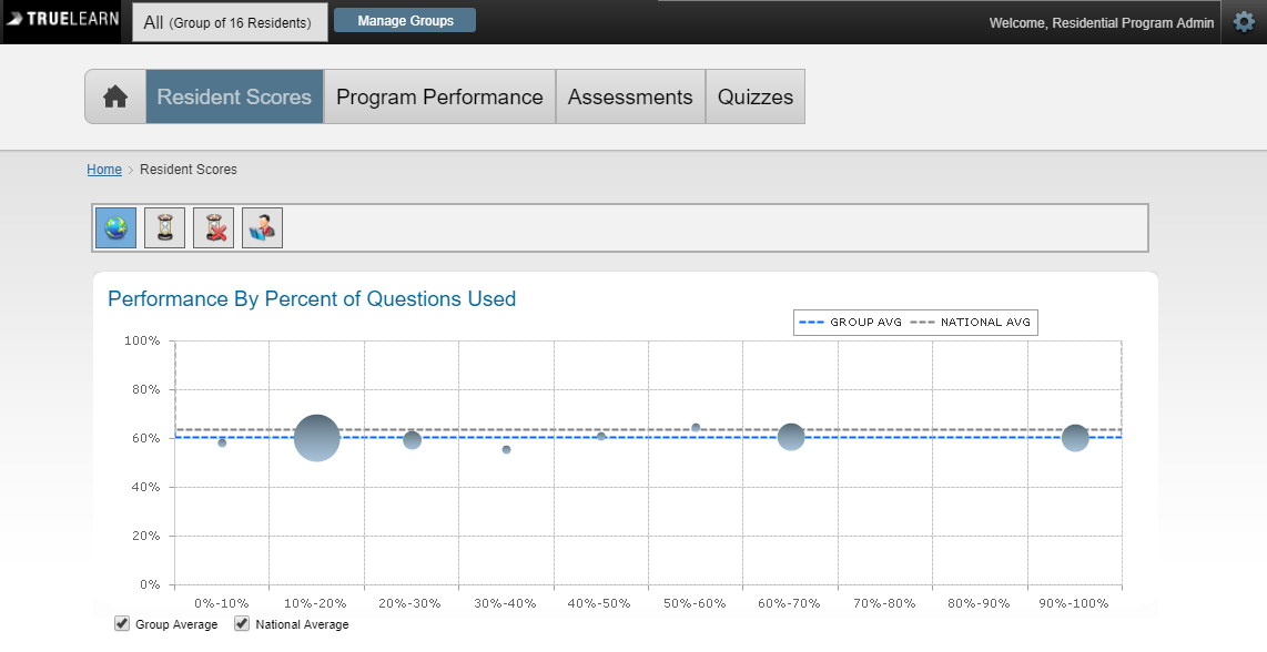
Located under this tab is a graph titled, “Performance By Percent of Questions Used.” Administrators can hover over the dots on this graph to see how many of the residents in the selected groups are taking questions. Clicking on these dots will break them down into smaller dots that represent each individual resident within the selected group and their corresponding data. This also shows the percentage of questions taken. This data is also available below the chart under the “Residents” section.
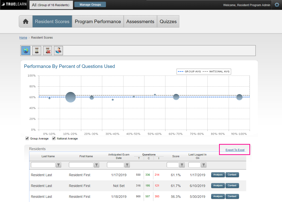
Next to each resident listed, is a summary of the total number of questions they have taken, the total number they have gotten correct, and the total number they have gotten incorrect. Their last login date will also be displayed, as well as an optional “Anticipated Exam Date” field, which can be set by the resident. Administrators can export this data using the “Export to Excel” function located in the upper right corner of the “Residents” section.
Analysis: The “Analysis” button in the “Residents” section will pull data specific to the selected resident’s performance. This information is broken down by tabs which are as follows,
- Overall Performance: Hovering over the black dots in this chart, will display a date range where the resident has taken questions. It will display their overall percent for the selected date range, total number of questions taken, total number of questions answered correctly, and total number of questions answered incorrectly. Clicking the black dots will display information for all tests that were taken within the specified date range.
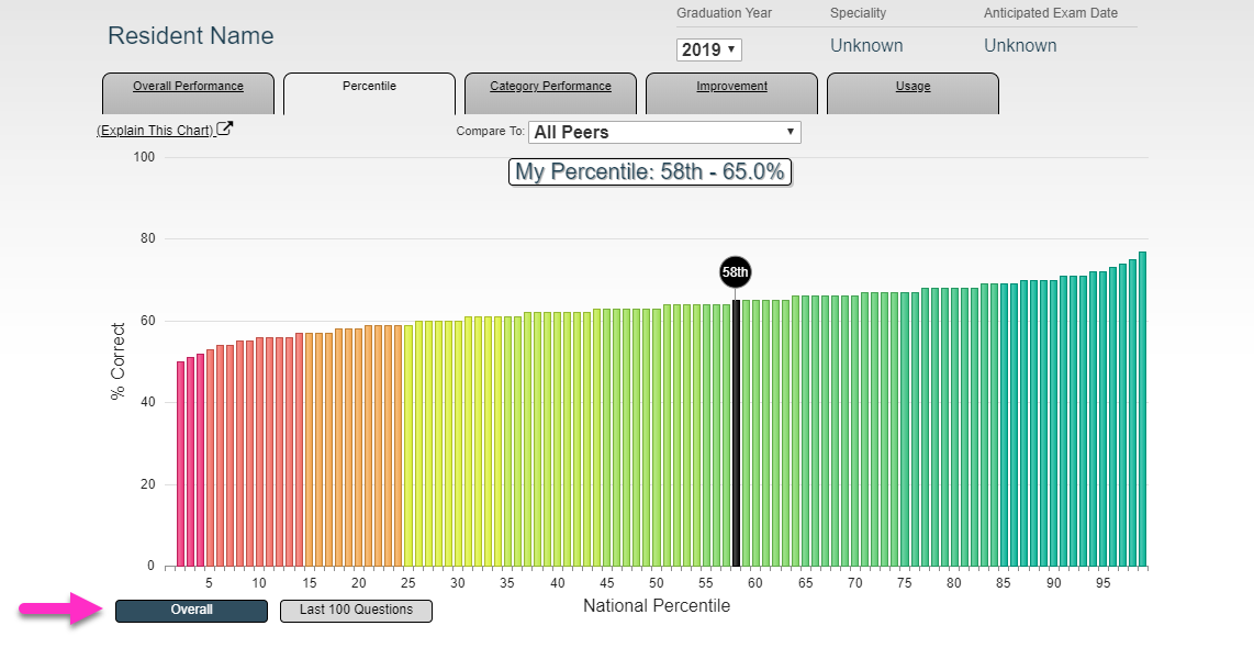
- Percentile: Administrators can click to view either the resident’s “Overall Percentile” or their percentile for the “Last 100 questions.”
- Category Performance: Administrators can select a category Axis by clicking on the dropdown menu to display corresponding data (Ex. “Body System”). Within each Axis there is a list of categories with a corresponding pie chart located under the “Used” column. Hovering over this pie chart will display the number of unique questions that were taken and the total number of questions available in the specified category
For each category, administrators can view the total number of questions taken, total number of questions answered correctly, and total number of questions answered incorrectly. The resident’s difference in comparison to the National Average will also be displayed. - Improvement
- Usage
Contact: Clicking this button will open up a window where the administrator can send a direct email to the resident.
Program Performance
At the top of the Program Performance page, there are four symbols. They represent the following:
- Globe – Statistics for All Tests
- Hourglass – Statistics for Timed Tests
- Hourglass with Red “X” through it – Statistics for Untimed Tests
- Person Reading – Statistics for Tutor Mode Tests
By selecting any of these symbols, the specified information will be updated accordingly.
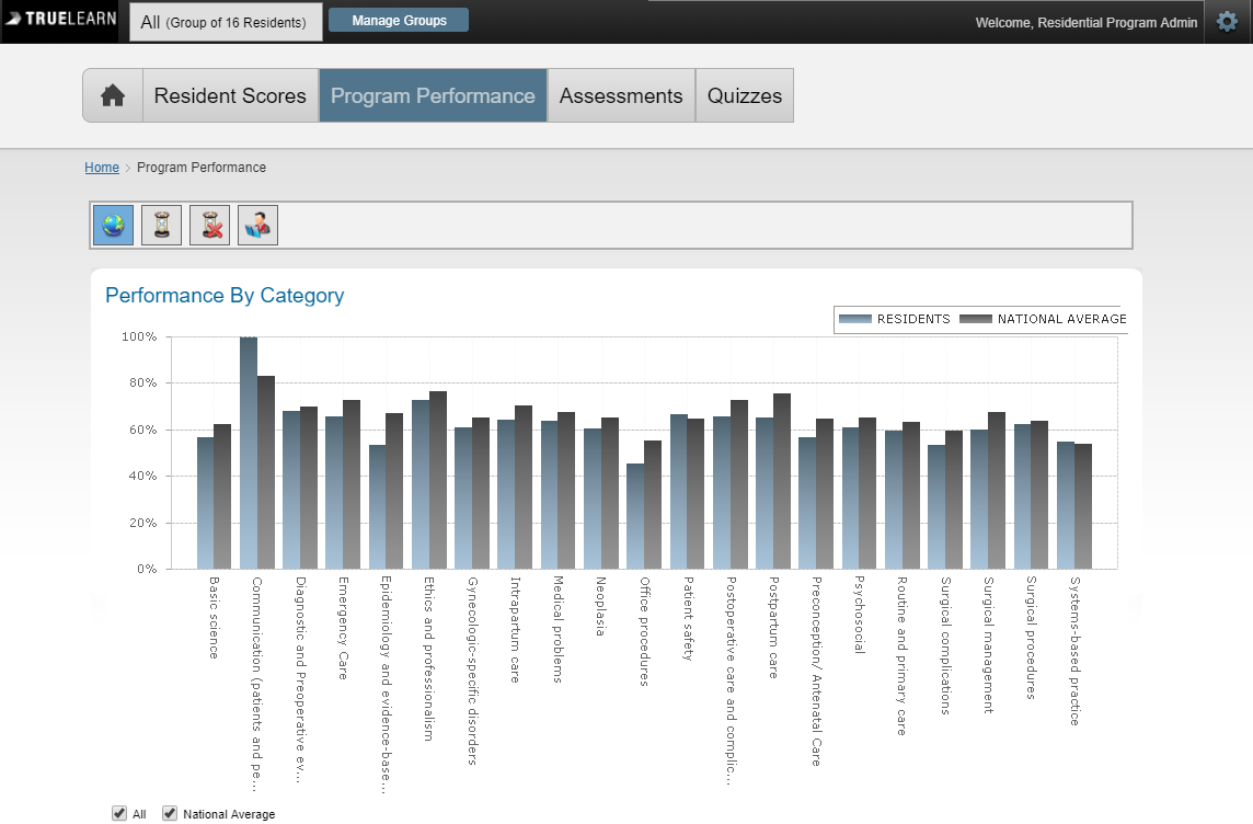
Under “Performance By Category” is the corresponding bar graph.
The blue bars represent the program’s residents, and the grey bars represent the National Average. Administrators can hover over any of the categories to view the exact percentage of the residents in the selected group in comparison to the national average. Administrators will have the option of deselecting the national average comparison below the graph by unchecking the box.
Administrators can select a category Axis by clicking on the dropdown menu to display corresponding data (Ex. “Body System”).
An alphabetic list of all categories is located below the graph. By clicking on “Category” at the top of the column, administrators can switch to reverse alphabetical order. The program’s top resident will be displayed, as well as their average, the specified group’s average, and the national average.