
pT Student scores tab overview
Please Note: Dashboard views may vary depending on administrator permissions.
Some categories may not be available. Unless filtered by a specific time range, all information displayed is in real time.
Learners Score Tab
The “Learner Scores” tab, shows the list of learners for each particular subscription. Information per learner will include the following,
- Total number of questions taken
- Questions answered correctly vs. incorrectly
- Anticipated Exam Date (if set, this field is optional)
- Last learner login date
At the top of the “Learner Scores” page, there are four symbols. They represent the following,
- Globe – Statistics for All Tests
- Hourglass – Statistics for Timed Tests
- Hourglass with Red “X” through it – Statistics for Untimed Tests
- Person Reading – Statistics for Tutor Mode Tests
By selecting any of these symbols, the “Learner Scores” information will be updated accordingly.
Located under this tab is a graph titled, “Performance By Percent of Questions Used.” Administrators can hover over the dots on this graph to see how many of the learners are taking questions.
Clicking on these dots will break them down into smaller dots that represent each individual learner and their corresponding data. This also shows the percentage of questions taken. This data is also available below the chart under the “Learners” section.
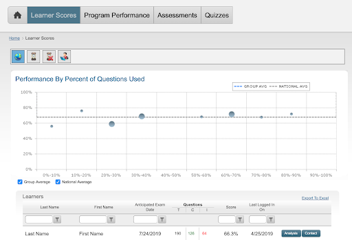
“Learners” Section
The “Analysis” button offers a detailed breakdown of each learner’s progress and is located next to the learner’s name (see the categories below).
Next to the “Analysis” button is the “Contact” button. Clicking this button will open up a window where the administrator can send a direct email to the learner.
Information Available Under the “Analysis” Button
Overall Performance Chart
The Overall Performance graph displays the selected learner’s performance over time utilizing a moving average and data points for specific tests (or quizzes).
Hovering over the black dots in this chart, will display a date range where the learner has taken questions. It will display their overall percent for the selected date range, total number of questions taken, total number of questions answered correctly, and total number of questions answered incorrectly.
Clicking the black dots will display information for all tests that were taken within the specified time range.The time range can be adjusted by moving the slider at the bottom of the chart. The learner’s moving average and bars representing the number of questions taken each day are displayed at the bottom of the chart.
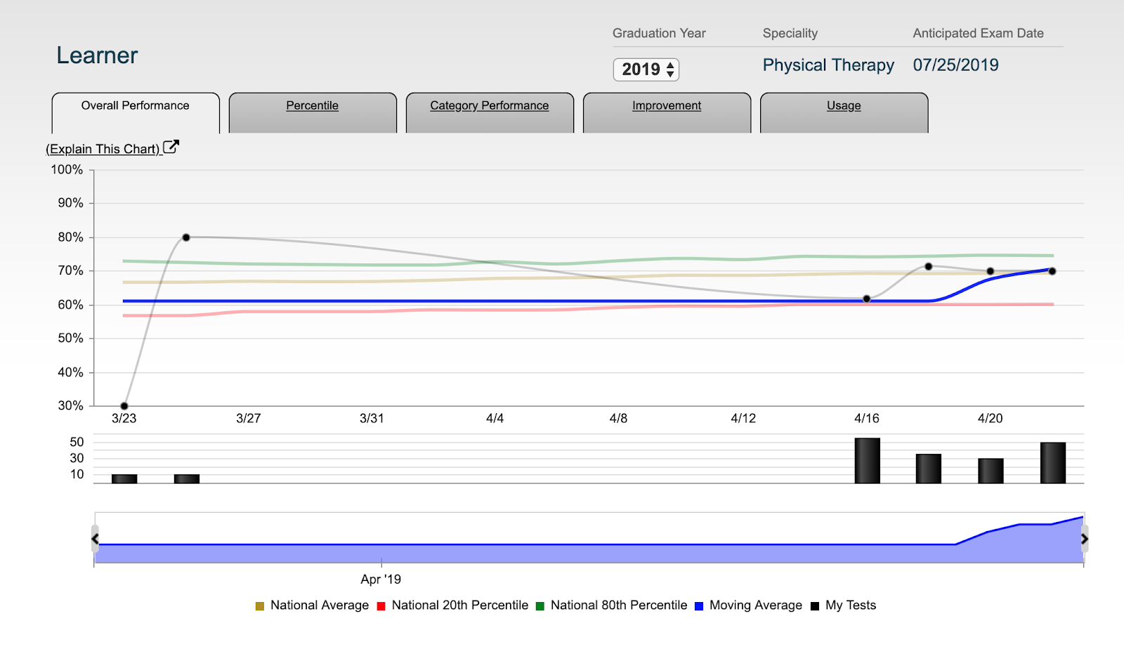
Key Chart Features
This graph displays data about a learner’s performance based on a set time window. Institutions can view learner performance spanning the entire length of their subscription, or “zoom in” to focus on a specific date range.
How to change the set time window (2 methods),
Drag the left or right handles in the time selection panel
Click the quick select buttons to jump to a specific window (ex. “Last Month”)
When administrators change the time window, the labels on the X axis will update accordingly.
Score & Question Volume
To view a learner’s score and volume of questions taken at each point in time, the top portion of the graph shows performance in percentile, and the bottom portion shows bars proportional to how many questions were taken.
Mouse-Over & Click Tooltips:
To activate Tooltips, administrators can simply hover their mouse over the “My Tests” data point or a question count bar.
Tooltips will display,
- The date range that is summarized by the data point
- The number of test questions taken
- The scores received by the selected individual on the specified tests
To view more information on the specified tests, administrators can click on the data point or the Tooltip.
To toggle the Data Series on or off, simply click on the name of the data series (ex. “National 20th Percentile”). This will toggle the data series from on to off and visa versa.
Data Definitions
Moving Average: The moving average includes the last 100 questions taken by a learner, and is calculated at the end of each day. This score includes questions that were taken in timed, untimed, and tutor mode, and includes all questions taken, including those that a learner has taken multiple times.
National Average: The National Average line includes the average scores of all learners on a specific day – including tests taken in timed, untimed, and tutor modes. The National Average is calculated by compiling the data associated with all learners’ first attempt at answering test questions only. This data is smoothed with a 30-day moving average to reduce day-to-day fluctuations.
National 20th and 80th Percentile: The National 20th/80th Percentile lines plot the test score required to be included in the 20th or 80th percentile of learners, respectively. These are calculated by leveraging scores from tests taken in timed, untimed, and tutor modes.
The percentiles are calculated based on learner performance on their last 100 questions. This data is smoothed with a 30-day moving average to reduce day-to-day fluctuations.
Percentiles Chart
The Percentile Chart shows how a learner compares in relation to their peers based on either “Overall Percentile”, or their “Last 100 Questions” taken. Administrators can view which percentile learners fall under are, and what score they need to achieve in order to attain a higher percentile.
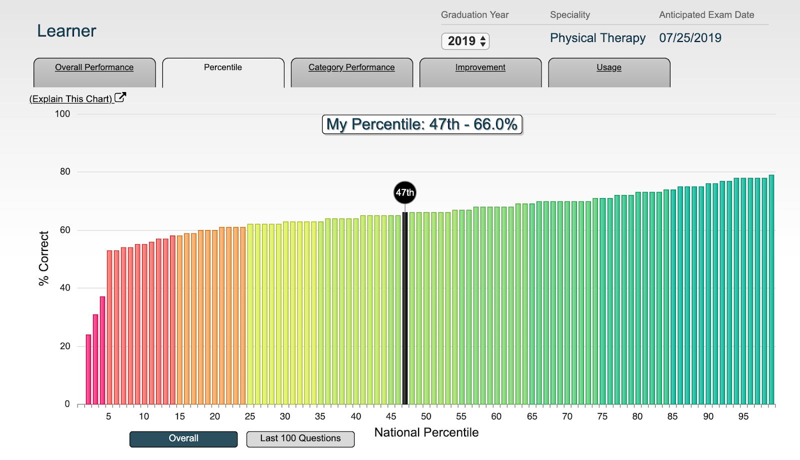
Key Chart Features
View Each Learner’s Standing Percentile Range: The percentile relative to peers is shown as a black bar labeled with the starting percentile in the learner’s performance range.
Score vs Percentile: The color-coded percentile bars are aligned in increasing order along the x-axis.The height of each bar corresponds to the score required to reach that specific percentile. To view a Tooltip showing the selected percentile and also the score that would be required to reach that percentile, administrators must simply hover over one of the bars.
All Time or Last 100: Compare a learner to their peers in overall performance, or see how their last 100 questions taken stack up to the last 100 questions taken by others. Toggle this setting by clicking the buttons below the chart.
Data Definitions
Overall Scores & Percentiles: Overall Score is calculated based on all questions taken in any mode, whether it be timed, untimed, or tutor, and includes questions taken just once or multiple times. Peer scores are similarly calculated including all modes regardless of whether questions were taken just once or multiple times. Once all active learners’ scores are recorded, percentiles are then calculated by breaking those learners up into 100 equal-sized groups.
Last 100 Scores & Percentiles: The Last 100 Score is calculated based on the last 100 questions taken in any mode, and, includes questions taken just once or multiple times. This Last 100 Score matches the Moving Average from other graphs and tables in the system. Note: The Last 100 Score only updates every 20 questions.
Peer scores are similarly calculated based on the last 100 questions taken and include all modes regardless of whether a question was taken once or multiple times. Once all active learners’ Last 100 Scores are recorded, percentiles are then calculated by breaking those learners up into 100 equal-sized groups.
Category Performance Chart
The Category Performance Chart displays how a learner is performing in each content category relative to their peers. This chart also displays the number of questions that have been taken in each category, how many unique questions are remaining, and the “weight” of each category for the exam.
Category Performance
- Administrators can select a category Axis by clicking on the dropdown menu to display corresponding data (Ex. “Body System”). Within each Axis there is a list of categories with a corresponding pie chart located under the “Used” column. Hovering over this pie chart will display the number of unique questions that were taken and the total number of questions available in the specified category
- For each category, administrators can view the total number of questions taken, total number of questions answered correctly, and total number of questions answered incorrectly. The learner’s difference in comparison to the National Average will also be displayed.
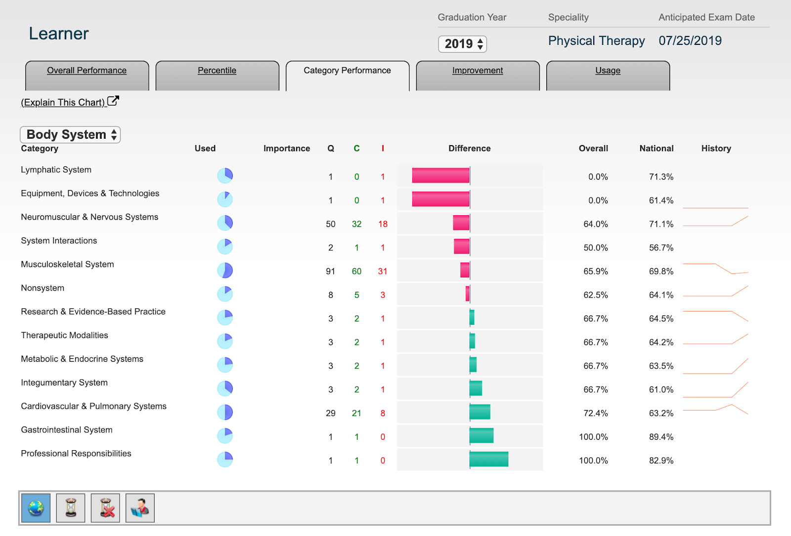
Key Chart Features
Strengths & Weaknesses: The Category Performance Chart is sorted from a learner’s weakest to strongest category, defined by their performance relative to their peers.
Change the Category Axes: Administrators can change category axes by using the dropdown. This is especially helpful for exams with blueprints containing multiple categorization axes. If the exam only has one categorization axis, the dropdown will not be displayed.
Performance, Completion, Importance: Each category displays how many questions have been taken, how performance compares nationally, and how “important” each category is/ how it is weighted on the exam.
Data Definitions
Completion: Completion is calculated for each category based on how many questions are available, and on how many questions have been taken at least once. If half of the questions are taken at least once, the pie chart corresponding to that category will be half full.
Administrators can hover their mouse over the completion pie chart to see how many questions are available, how many have been taken at least once, and a count of how many questions total have been taken in each category (includes duplicate times taking the same question).
Importance: Importance displays the weight of each category as described in the exam blueprint. Our content and author teams strive to ensure that our question quantities in each category reflect the distribution of questions on the actual exam. The larger the Importance bar for a given category, the more questions from that category will be seen on the exam.
Q / C / I: Q/C/I displays the count of Questions (Q) taken in the category, the number of Correct (C) responses provided for those questions, and the number of Incorrect (I) responses. I + C will always equal Q for each category.
Q/C/I are calculated using all modes, considering questions from all time during the subscription, and includes all questions regardless of whether or not it is the first time they have been served.
Overall, National, Difference: Overall % is simply the # of Correct answers in the category divided by the total # of Questions taken in the category, or “C/Q.”
The National Average for the category is the score that peers have attained on the questions in the category for all modes.
The Difference is calculated by subtracting “Overall Performance” for a category from the “National Average” of that category. If the score in the category is below the national average, the Difference will show a negative red bar. Conversely, categories showing scoring above the national average will show positive green bars. To view the numerical Difference value, administrators must hover their mouse of each Difference bar.
History: History shows a trendline of a learner’s performance in the category at various points throughout the subscription.
IMPROVEMENT CHART
This chart displays a learner’s moving average performance as a function of the number of questions taken – either counting only the first time a question has been seen (‘Unique Questions Only’) or counting all questions including duplicates (‘All Questions’). This score will either increase or decrease as more questions are taken, meaning administrators will be able to visualize the average rate of improvement for a specified learner and see how it compares to the National Average performance and rate of improvement.
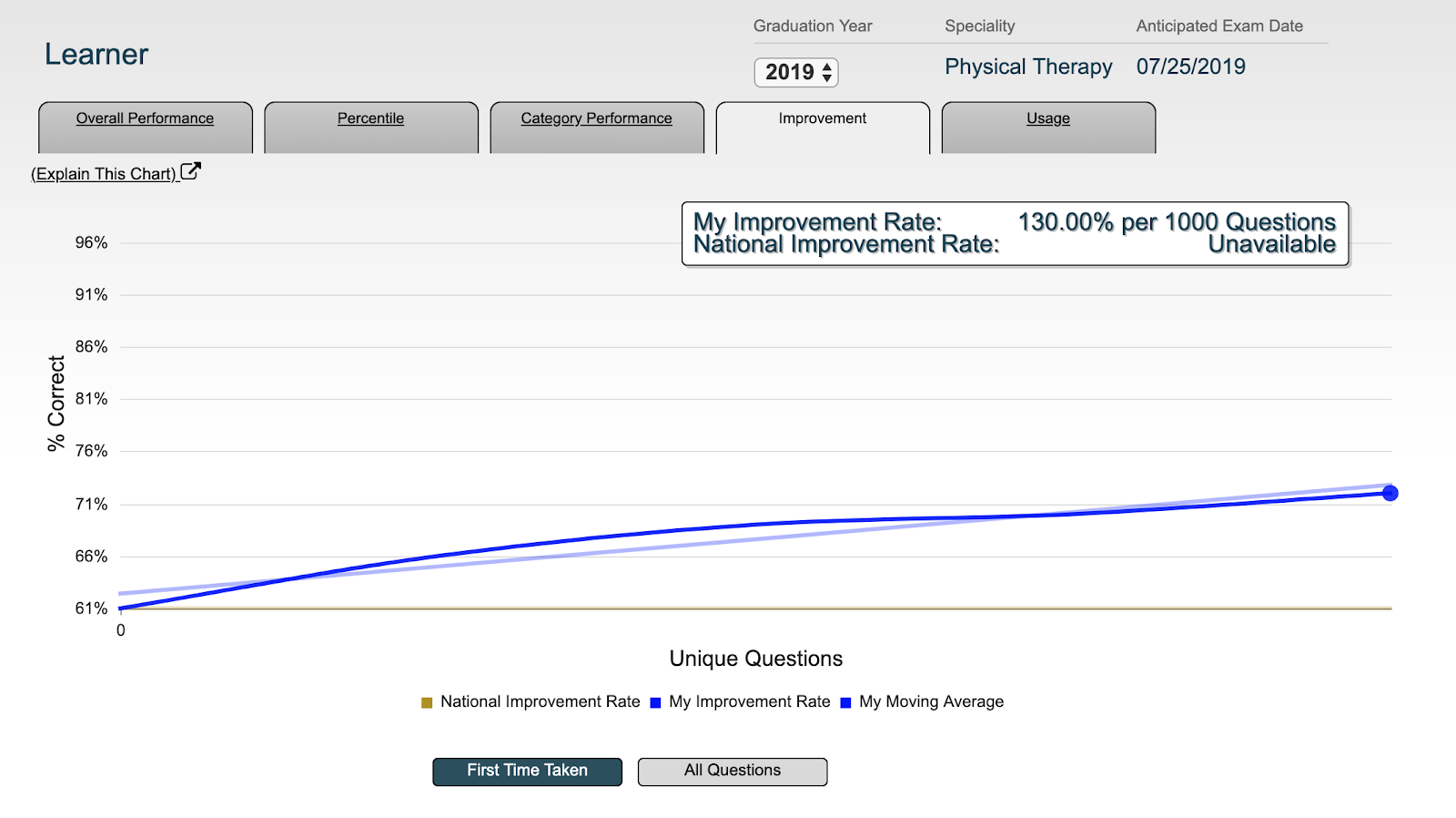
Key Chart Features
Visualize Improvement: Administrators can view a learner’s moving average calculated as they progress through the available practice questions. A Best Fit line will show a learner’s “Improvement Rate Trend.” The chart will ‘blink’ indicating a learner’s current data point.
Note: taking randomized exams throughout preparation will result in clearer improvement; jumping from one category to the next will obscure the improvement pattern.
Compare to the National Average: The National Average for peers as they take more and more questions is calculated, with a Best Fit line representing the National Average at each question count and the slope representing the National Improvement Rate.
Toggle between First Time Taken & All Questions: Administrators can switch to “All Questions” to view how performance is affected by taking questions multiple times, or keep the setting on “First Time Taken” to only consider the first time each question was seen for a purer assessment of improvement.
Note: a National Improvement Rate is not calculated for the All Questions setting since multiple passes through the questions would skew the statistics.
Data Definitions
My Moving Average: A learner’s Moving Average is calculated every 20 questions and considers their prior 100 questions from that point. The first data point will reflect questions 1-100, and the 2nd data point will consider questions 21-120, and onward. This calculation includes questions from all testing modes. Whether or not the calculation includes duplicate questions or only considers the first time each question was taken depends on whether the “First Time Taken” or the “All Questions” option was selected.
My Improvement Rate: The Improvement Rate is a linear best fit line through the Moving Average data. The slope is expressed in % per 1000 questions. If 500 questions were taken and the moving average is currently at 50% with an Improvement Rate of 10% per 1000 questions, then the assumption would be that improvement could be expected at performance by 5% by taking a further 500 questions, assuming that the rate of improvement held constant. The Improvement Rate may differ depending on whether “First Time Taken” or “All Questions” has been selected.
National Improvement Rate: National Improvement Rate is calculated by averaging peers’ moving average at each question count. This data is then fit with a Best Fit line to show a National Improvement Rate. This calculation is only performed for First Time Taken; considering other learners’ performance when repeating questions would likely inflate the Improvement Rate, so it is not calculated for All Questions.
Usage Chart
The Usage Chart shows a learner’s count of questions at different times during the subscription, and also summarizes how they are taking questions in terms of ‘test mode’ and whether they are duplicating questions.
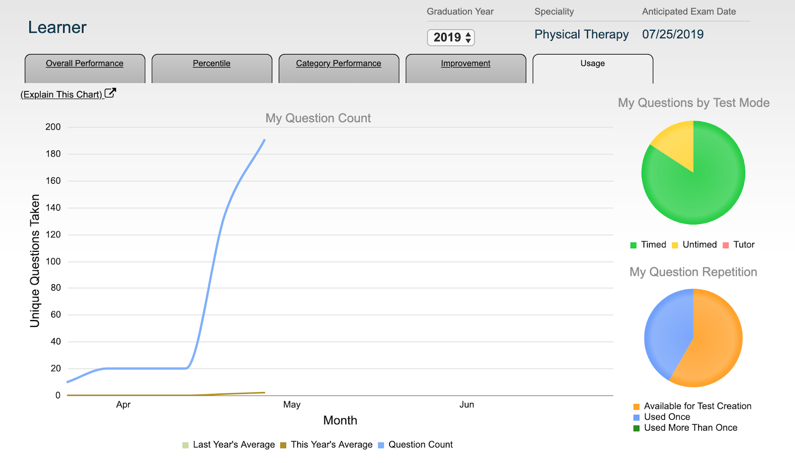
Key Chart Features
Track Study Plans: A learner can make a study plan for how many questions they want to complete as they prepare for the exam, and track how their actual studying follows their set goal.
View Testing Habits: View if a learner has been taking more timed, untimed, or tutor mode practice questions
Plan Multiple Passes: View how many questions have never been taken, how many have been taken exactly once, and how many have been duplicated from being taken multiple times.
Data Definitions
My Question Count: The “My Question Count” graph displays the count of unique questions by date. The count is cumulative, so the graph’s “My Question Count” value is always increasing or remaining flat. This graph only includes unique questions. Since taking questions multiple times does not increase the “Unique Question Count”, the count will cap out at the number of questions available for the exam.
My Questions by Test Mode: This pie chart displays the portion of all questions taken, including questions taken multiple times, and tests taken in Timed, Untimed, or Tutor Mode. To view the count of questions taken in each mode, administrators can hover over each section of the pie chart with their mouse.
My Question Repetition: Of all the available questions for the exam, this pie chart shows the portion of questions that have never been taken, the portion that have been taken exactly once, and the portion that have been taken two or more times. To view questions that remain untaken, questions taken once, or questions taken more than once, administrators can hover over each section of the pie chart.